
Follow-up-1 on "I HOPE there is nothing to see here ... "
Maybe there really is ...

So, in my previous post I HOPE there is nothing to see here ... I pretty much admitted that I’m a lazy guy and only looked at a single month, May 2022, the latest data (I’m not sure, should I say data or numbers), and therefore the longest time period since people first started getting Vax’d.
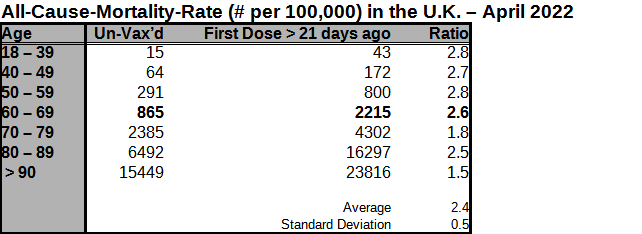
Of course, the data?/numbers from that month could have been a statistical aberration, so, I looked at the previous month as well, April 2022. I found the results to be very similar, as shown in the Table below:
So, I hate to say this, but there REALLY might be something here.
Now, in that ONS Data, I am only looking at two pieces of age-stratified data:
Unvaxed; and
Vax’d more than 21 days ago
So, if there is anything to be seen here, it will just be the long-term effects of the Vax, not short-term effects, which I conjecture are significant, as I pointed out in my post I'm sure there is nothing to see here ..., or as can been seen, sticking up like a sore thumb in VAERS data base (see my post: People are Dying).
Of course, from these data?/numbers we don’t know if the folks have been Vax’d for 21 days, or 600 days.
So, the April 2022 ONS data?/numbers seem to tell the same story …
I conjecture that if I were to do this for every month starting back from the earliest data?/numbers in the ONS spreadsheet I’d see the ratio of the all-cause-death-rate between the Vax’d and the un-Vax’d to increase over time.
And, if I had a graduate student, I’d already see in front of me a graph showing the following:
The ratio of All-Cause-Mortality of Vax’d/Non-Vaxed for each age stratification starting from Jan 2021 —
i.e., a beautiful graph over 18 months, one line for each age-stratification, all on a single graph.
I’ll do this myself — but I’ll bet someone else could beat me to it and publish it before I do!
The data is their on our computerised medical notes, at least here in Scotland.